Comprehensive Branding Guidelines for Netcash:
Essential Rules and Information for Internal and External Use

The Corporate logo
The Netcash corporate logo comprises two elements, the logo symbol and logo type. The logo type has been carefully chosen for its modern yet refined, highly legible style, which has been further enhanced by the use of lowercase letters.
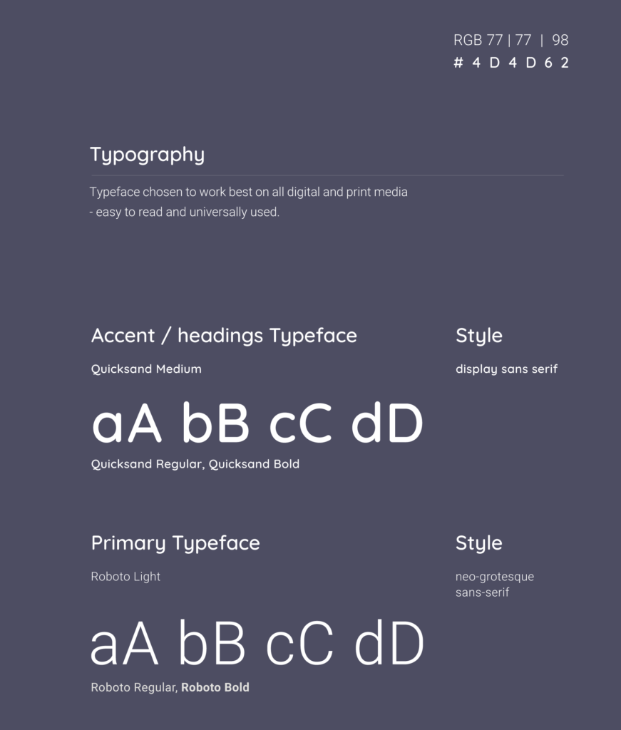
The typeface of Netcash is a custom designed font and is paired with the Quicksand font family and has also been chosen to compliment and balance perfectly with the logo symbol.
The Netcash corporate logo comprises two elements, the logo symbol and logo type. The logo type has been carefully chosen for its modern yet refined, highly legible style, which has been further enhanced by the use of
lowercase letters.
The typeface of Netcash is a custom designed font and is paired with the Quicksand font family and has also been chosen to compliment and balance perfectly with the logo symbol


The Netcash logo can be used on a variety of backgrounds.
Please see what is allowed and which is not allowed based on our brand guidelines and any digital marketing assets done by external companies needs to be approved by the Netcash marketing team.
Allowed

Not Allowed

Brand colours and Font usage.
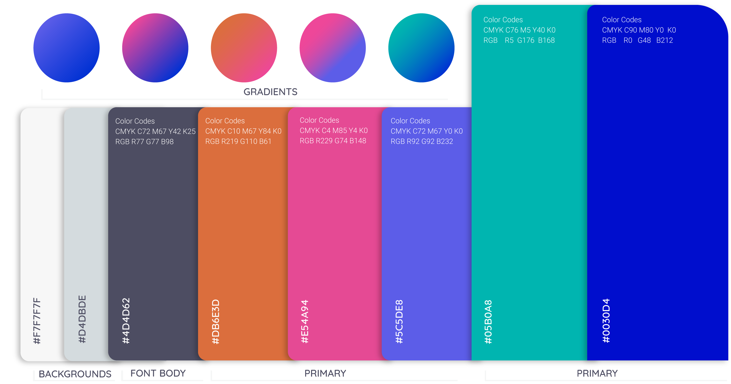
Colour plays an important role in the Netcash corporate identity program. These colours are recommendations for various digital media and assets. A palette of primary colours has been developed, which comprise of a blue, pink & turquoise. Consistent use of these colors will contribute to the cohesive and harmonious look of the Netcash brand identity across all relevant media Primary and accent colours can be used together throughout all digital assets in a tasteful manner. When working with designs, work in RGB for digital designs and CMYK for print. Very important.


